
Bell Tower Electric
A culminating project in which I designed a responsive website based upon best UX practices, as well as the logos and branding, for an electrical contractor start-up.
Tools & Tasks: WordPress, Adobe Illustrator & InDesign, market analysis, information architecture, wireframing, prototyping, usability testing
Role: UX Designer, Branding Strategist
Duration: 6 months

Project Overview
The Bell Tower Electric project explores the development of a streamlined responsive website design from the ground up. Through careful research, I gathered the necessary data to ensure a user-centered approach, of which methodologies will be investigated in further detail.
About the Company
Bell Tower Electric is an electrical contractor start-up based in Raleigh, North Carolina. My clients founded their business in early 2020 and did not have an existing website, logo, or branding. In order to reach new clients, they requested a website that highlights detailed service information while keeping a community-minded business approach.
Business Goals:
Launch website with defined logo and branding identity
Attract new customers and increase sales
Maintain a steady number of monthly jobs
The Users
The focal point of this project is local homeowners in need of electrical services. The secondary audience includes small commercial businesses in Raleigh, which will become the target in the near future.
User Goals:
Quickly find electrical service information
Easily locate pricing details
View contact information and send form
Personas
I created two personas to express the diverse needs of Raleigh homeowners, which helped identify potential clients and maintain a user-centered focus.
Chiara de Luca
Chiara’s priority is to find reasonably priced electrical services for her older home.
Pat and Jan Yu
Pat and Jan need to find quality electrical services that will meet their tight deadline.
User Flow
To help identify key tasks and potential paths, I drafted two user flows. Our persona, Chiara, will be interacting with the site to confirm available services and fill out an estimate form.

User: Chiara
Device: Desktop computer
Priorities: Confirm services, stay on budget
Task 1: Confirm Available Services
Chiara needs to confirm that electrical installation and inspection services are currently offered.
Task 2: Submit Estimate Form
Working with a tight budget, Chiara needs to send an estimate form inquiring about a rough price point.
Market Analysis
I conducted a market analysis for five different businesses based in Seattle and Raleigh. My goal was to evaluate their websites to identify common industry trends and pain points. First, I defined the evaluation criteria based on core user needs:
Quick access to a list of electrical services
Free estimate/bid form
Easy access to contact information
Credible customer reviews
Overall in-depth service details

Electrical Industry Investigation
Evaluating each company’s website helped me learn about common industry trends and pain points. View full report >
Findings
After carefully analyzing the data, two businesses ranked the highest - but none were able to meet all five criteria. Finding the balance between a clear, efficient design and detailed service information presents itself as a unique industry challenge.
The Winners: Electric All Pro and Express Electrical Services
Pros: Clear, in-depth service information and project photos.
Cons: Layouts lack consistency, both fail to meet accessibility standards.

“Finding the balance between a clear, efficient design and detailed service information presents itself as a unique industry challenge.”
Sitemap
As I conducted a tree test (next section) and implemented feedback, I continued to refine the sitemap. Before launching the website, my client requested to simplify since he was unable to provide in-depth content. The final version consolidates the structure for streamlined navigation.
Draft 1: Included five pages with a drop-down for Services.
Draft 2: Removed the Pricing page to streamline key tasks.

Final Draft
The simplified structure features a streamlined navigation and highlights key content.

Information Architecture
In order to understand if the main navigation was structured effectively, I conducted a tree test using Optimal Workshop. The test included 3 tasks and 3 questionnaires with a total of 5 participants. My goal was to refine the site’s information architecture to successfully guide the user in accomplishing key tasks.

Diverse Test Results
The results confirmed that participants had a diverse response navigating the site’s structure. View full report >
Tree Test Findings
Based on the task and questionnaire results, I was able to answer the following questions:
“Is it easy to locate a particular residential service?”
Yes! The task test showed a 100% direct success and the questionnaire reported that 80% of participants found it easy.
“Where do users look for pricing info?”
The task test reported that 60% of participants navigated to Pricing to locate installation estimates. The questionnaire reported that 80% of participants selected Pricing.
“Is nesting the FAQ page under Services the best location for quick/easy access?”
Not necessarily. The task test concluded a 40% direct success and the questionnaire showed that users searched in a variety of locations (the Services, About, and Contact pages). I also received peer feedback to merge the FAQ to individual service pages, as well as consolidate the Pricing page and the bid form.
Low-Fidelity Wireframes
I began the ideation phase by sketching several rough website layouts. Next I built upon these basic concepts to create an accessible wireframe structure for each page that highlights important service details.

The home page wireframe.

The About page wireframe.

The Services page wireframe.

The Contact page wireframe.
“Usability testing offered an effective way to evaluate my designs while highlighting critical pain points.”
Usability Testing
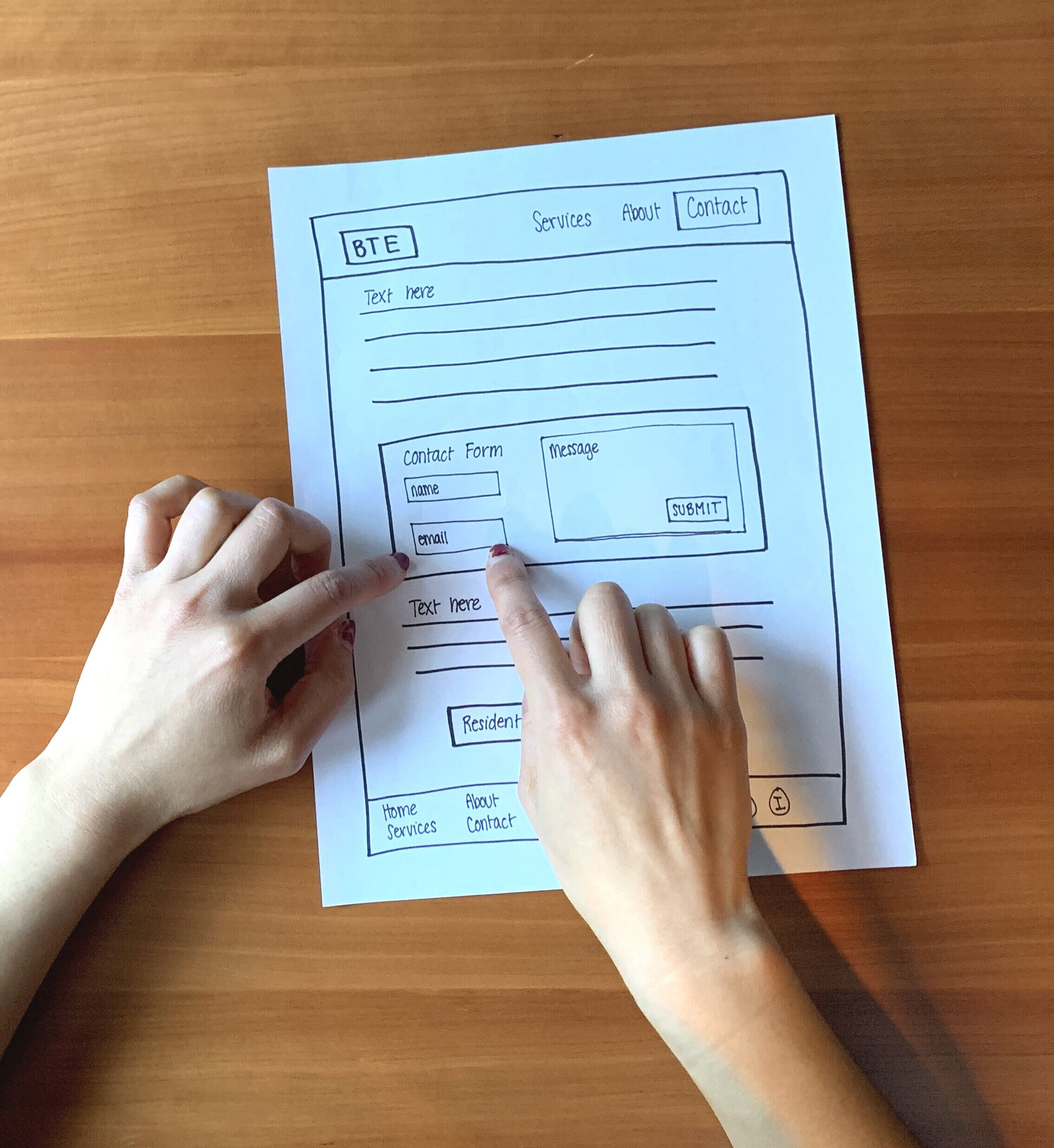
Paper Prototype
I used paper prototypes to test my wireframes and made adjustments to the second draft in between testing (shown below). This offered an effective way to evaluate my designs while highlighting critical pain points.

Test 1: Main Navigation
I conducted two usability tests to evaluate my design’s navigation and overall structure. The participant, acting as the persona Pat and Jan, was given 3 tasks.

Persona: Pat & Jan
Device: Desktop computer
Priorities: Complete project goals, meet tight deadline
Task 1: Find the Light Fixtures Page
Your goal is to find service information for light fixture installations. Since you have a tight deadline, you need to locate a time estimate and project difficulty, as well as price range.
User Path: Home > select Services > select Residential Services > select Light Fixtures > review time estimate, project difficulty, and price > click on Contact Us button.
Task 2: Find the Dimmer Switches Page
Your next goal is to locate service information for dimmer switches installations.
User Path: Light Fixtures page > return to Residential Services page > select Dimmer Switches > review time estimate, project difficulty, and price > click on Contact Us button.
Task 3: Submit a Request Form
Now that you’ve located the services information, you will need to submit a request form to inquire about your project timeline and total cost.
User Path: Home > select Contact > type in name, email, message (project details) > click submit > review confirmation message.
Test 2: Residential and Service Pages
After the first test, I made adjustments to the prototype’s Residential Services, Featured Service, and Contact pages. My goal for the second test was to focus solely on the structural changes.
The participant was given the exact same tasks.
The participant followed a similar path for both tests.
Participant Feedback
In both rounds of testing, the participant successfully completed all tasks. Initially, I asked if any steps were unclear, and they replied that “everything was pretty straightforward.” However, there were a couple pain points:
It wasn’t clear to scroll down or click next on the Residential Services page.
On the Featured Service pages, certain features could be designed more visually (ex: the project difficulty range).
After the second test, I asked if the participant thought that the structural changes I had made improved the overall navigation. They replied that the adjustments made the site “much easier to navigate.”

High-fidelity Mockups
After conducting the usability tests, I gained enough feedback to develop the high-fidelity mockups. Pictured below are the second drafts after adjusting the Residential Services, Featured Service, and Contact pages.

The home page mockup.

The Light Fixtures (specific service page) mockup.

The Residential Services page mockup.

The About page mockup.

The Contact page mockup.
Mockups vs. Live Website
Several last minute changes were made to the navigation and service information pages. The live WordPress website is a more simplified, condensed version:
I removed the breadcrumbs since the final navigation currently doesn’t have drop-downs.
I added a search bar above the main navigation to help streamline user searches.
Social media icons will be added at a later date.
The main logo replaced the alternate logo in the footer.
Branding and Logos

Define the Mood
To ensure that the branding would fit my client’s vision, I first created a mood board. We brainstormed key words, such as “bold” and “minimal” and “modern,” to define the overall tone.

Keep the Branding Consistent
I created a branding board to help define Bell Tower Electric’s branding identity and set the standard. Inspired by the Pacific Northwest, we chose navy blue with slate grey tones and a warm concrete texture.
Logo Design Process
Sketch, Refine, Repeat
To start the ideation phase, I sketched dozens of rough ideas, sought feedback, and made adjustments. Through this process of refinement I continued to improve the designs until achieving the final concept.
Seek Honest Feedback
As I transitioned to the digital versions, I asked a graphic designer’s critique to polish up my designs for a sleek, professional look.

Take a peek at the live website to see the work come to life
Conclusion
The Bell Tower Electric project challenged me to grow tremendously as a designer. I strengthened my collaboration skills working directly with clients while learning how to build a relevant, human-centered product.
Lessons Learned
1. The messier the better. Allow space for the designs to evolve over time... no matter how messy! Multiple drafts of sketching, wireframing, and prototyping played a crucial role in refining my work.
2. Seek honest feedback. Listening to my peers, instructor, and client’s feedback identified critical pain points and sparked creative solutions.
3. Adapt to unexpected challenges. I learned how to quickly adapt to last-minute changes. Even though the final website is vastly different from my original design, it still follows a user-centered approach that meets my client’s needs.
A special thanks to my Bellevue College peers and instructor, Sarah Starck for her logo design feedback, and Buck Fleming for his WordPress help.