Leadr Learning 2.0
I updated Leadr's educational module to streamline key user actions, modernize essential UI elements, accomplish WCAG compliant improvements, and enhance the overall ease of use.
Tools & Tasks: Figma and FigJam, wireframing, prototyping, user flows, information architecture, WCAG accessibility guidelines, research, design consistency and branding
Company: Leadr
Role: UX Designer
Duration: 4 months

Problem Statement
“How can we improve Leadr’s current learning module, Learning 2.0, to streamline ease of use and increase accessibility?”
Leadr is a Software as a service (SaaS) company that is redefining people development in the workplace. The learning module is a space within its web app where users can access and absorb a variety of educational content. As the company has seen rapid growth in recent years, the initial prototype has experienced several updates until taking shape as Learning 2.0. While this version is a considerable improvement, its pain points still have had a considerable impact on the overall user experience.
Watch Leadr’s demo of the Learning module from January 2021 (advance to 7:35).
Design Challenges
I partnered with talented cross-functional teams to find new solutions while navigating the following challenges.
Incohesive UI Elements: The learning module utilized a variety of dated button designs, icons, and color schemes from previous versions. Updating and merging these elements into a new, cohesive interface, while staying true to branding guidelines, required many clarifying conversations.
Limited Research: Previous teams weren’t able to conduct in-depth research or usability testing when building versions 1.0 and 2.0, so the designs weren’t built upon tangible data or user feedback.
Fast Start-up Culture: Time and resources were limited to invest into a robust design process. Research and usability testing was less of a focus in order to meet tight deadlines.

Meet Learning 2.0
The Learning module is a section within Leadr’s web app platform that hosts a variety of educational resources ranging from academic PDFs, TedTalks, and creative podcasts. By providing these resources, the mission is to support each user’s unique learning journey and empower leaders in the workplace.
The Structure
Version 2.0 follows a unique structure that utilizes a dashboard and drawer views.

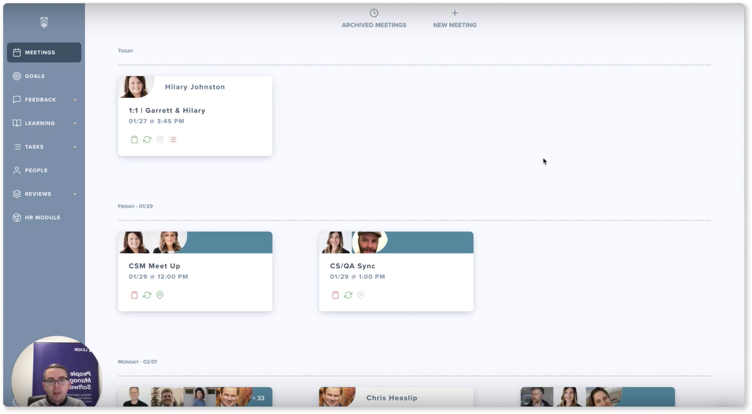
Learning Dashboard
The user starts in the Learning dashboard. They can see assignments here but can’t browse for content.

Learning Library
To access content, the user selects the “View Library” button. A drawer pops open where the user can view all content inside the library.
The Content
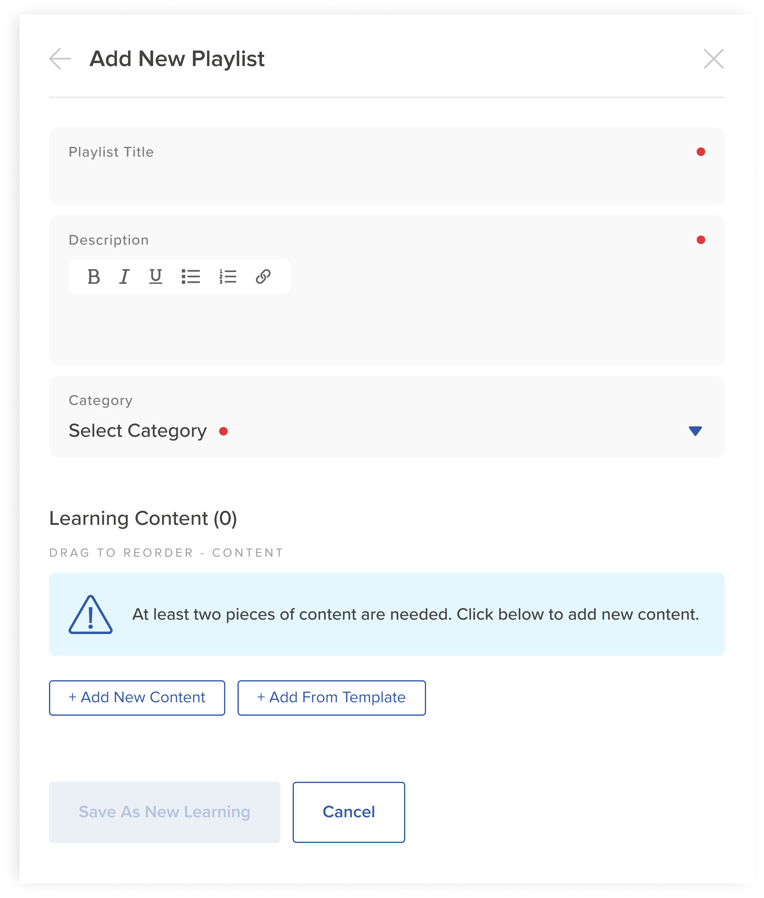
Users can save, create, and add their own content inside the library. Learning 2.0 features two different content types:
Single Learning: a stand-alone piece of content.
Learning Playlist: a collection or grouping of 2 or more pieces of content.

Different Content Types, Different Flows
The content type determines the paths that users will follow to complete a task.
Note: The terms “Learning Journey” and “Learning Template” have been updated (see the Information Architecture section below).
Pain Points
Complicated User Flows: Executing important tasks, such as browsing or saving content, require an excess number of steps.
Incohesive Interface: The platform utilizes a combination of dated and modern graphic elements from versions 1.0 and 2.0.
Content Type Unclear: Learning cards within the Learning Library or dashboard don’t provide a clear visual cue (Learning Playlist vs. Single Content).
Confined Workspace: Several key tasks are completed inside the drawer, which takes up a small fraction of the user’s screen.
User Flows
When users interact with Learning 2.0 there’s several key user flows, such as browsing for content, completing an assignment, etc. I will focus on one of the most common tasks.
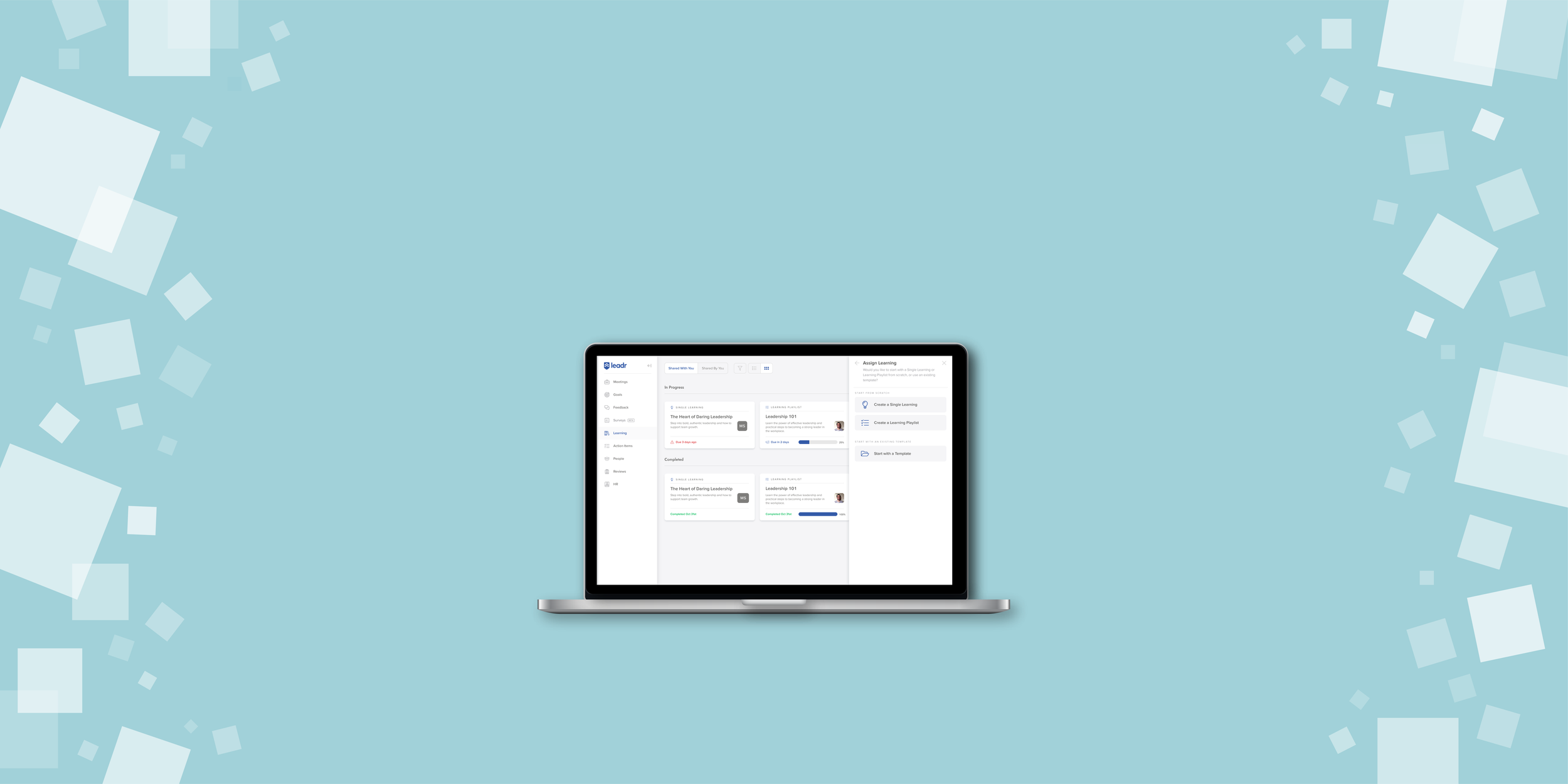
Task: Assign a Learning Playlist
Let’s say the user wants to learn more about leadership in the workplace. They decide to create and assign a Learning Playlist to discuss with their team. Depending on if the user wants to create from scratch or use a template, they will follow a series of steps to complete the task.

Complex User Flows
Assigning a Learning Playlist is one of the most common user tasks, but its original flow was unnecessarily complex. I simplified steps to improve overall efficiency.
My Improvements
I reduced the number of action steps by removing an additional screen. Instead of having to click through two drawers to reach the template, the user only needs to click once.
I enhanced the navigation by adding an informational banner to notify the user of their location and that they’re in process of completing a task. I also removed the Add Content button to help users stay on track.
I added core functionality by allowing the use of templates when adding individual content inside of a Learning Playlist. This greatly increases flexibility when building a customized playlist.

UI Element Updates
Learning 2.0 used a combination of old and new icons, buttons, and graphics. I updated its UI elements to provide a more cohesive visual experience and address accessibility concerns.
Learning Dashboard Cards

Before
The cards didn’t indicate content type and had low contrast.

After
I added the content type and changed the font and progress bar colors.
Learning Library Cards

Before
The original library card designs didn’t specify the content type.

After
I added an overlay and content count to differentiate Learning Playlists.
Warning Messages

Before
The warning message font color was hard to read and the icon irrelevant.
After
I adjusted the font color and updated the icon to give tangible context.
Information Architecture
Each company has a unique approach to labeling site structure, naming products, and referring to different UI elements. I quickly realized that the Leadr’s language culture was still being formed, which pushed me to clarify key taxonomy.
Company Wide Language
Oftentimes team members would refer to the same module or element using different terms. This caused unnecessary confusion and slowed productivity. To better grasp this challenge, I started at the root to identify language patterns.

Mapping Out the Terms
I grouped commonly used terms to create a taxonomy web, which helped identify existing patterns.
Module Specific Taxonomy
I initiated several team-wide clarifying conversations to draft Learning 2.0: Project Specific Terms, which defines all commonly used terms. After gathering team member’s proposals, we passed through several rounds of voting to reach a finalized version.


Accessibility Adjustments
Designing an inclusive interface - for all users - is a crucial component of my design methodology. Initially, Learning 2.0 presented several accessibility concerns, which was a big focus area for my work.

Color Contrast: I increased font, button, and icon color contrast levels to meet WCAG standards.

Header Hierarchy: I adjusted section headers for greater consistency, as well as increased font sizes to improve legibility.

Content Selectors: To guide users who may navigate by tabbing, I added a selected content outline and a completed content checkmark icon.
The New & Improved Learning 2.0
The Learning 2.0 live Figma interactive prototype reflects my design updates and enhancements. I’ve included three key tasks to give a feel for the interface:
View the Learning Library
Add a new learning to the Learning Library
Assign a learning

Conclusion
Partnering with Leadr’s talented team was a unique learning experience that helped me grow tremendously as a designer. I gained several valuable perspectives that I can apply to future projects:
Lessons Learned
1. It’s ok not to be perfect. When facing tight deadlines, I was encouraged to move faster and confidently own my design decisions. They weren’t perfect every time, but I had support from my team to continue growing.
2. When merging old and new UI elements, it takes time to make considerable updates to an existing interface. I discovered that a gradual process, rather than a complete overhaul, was a more realistic approach.
3. It pays off to initiate clarifying conversations. While it can seem like an extra step, I learned that making sure my team was on the same page saved energy in the long run. These conversations also challenged me to step into a leadership mindset.