Libum Corporate Website
I refined Libum’s corporate website to enhance UI styling elements, streamline key user actions, accomplish WCAG compliant improvements, and develop a strong branding identity.
Tools & Tasks: Figma, wireframing, prototyping, interface design, WCAG accessibility guidelines, research, design consistency and branding, basic HTML & CSS
Company: Libum
Role: UX Designer
Duration: 1 year 4 months

Problem Statement
“How can we refine Libum’s existing website to create a more streamlined, consistent, and accessible user experience?”
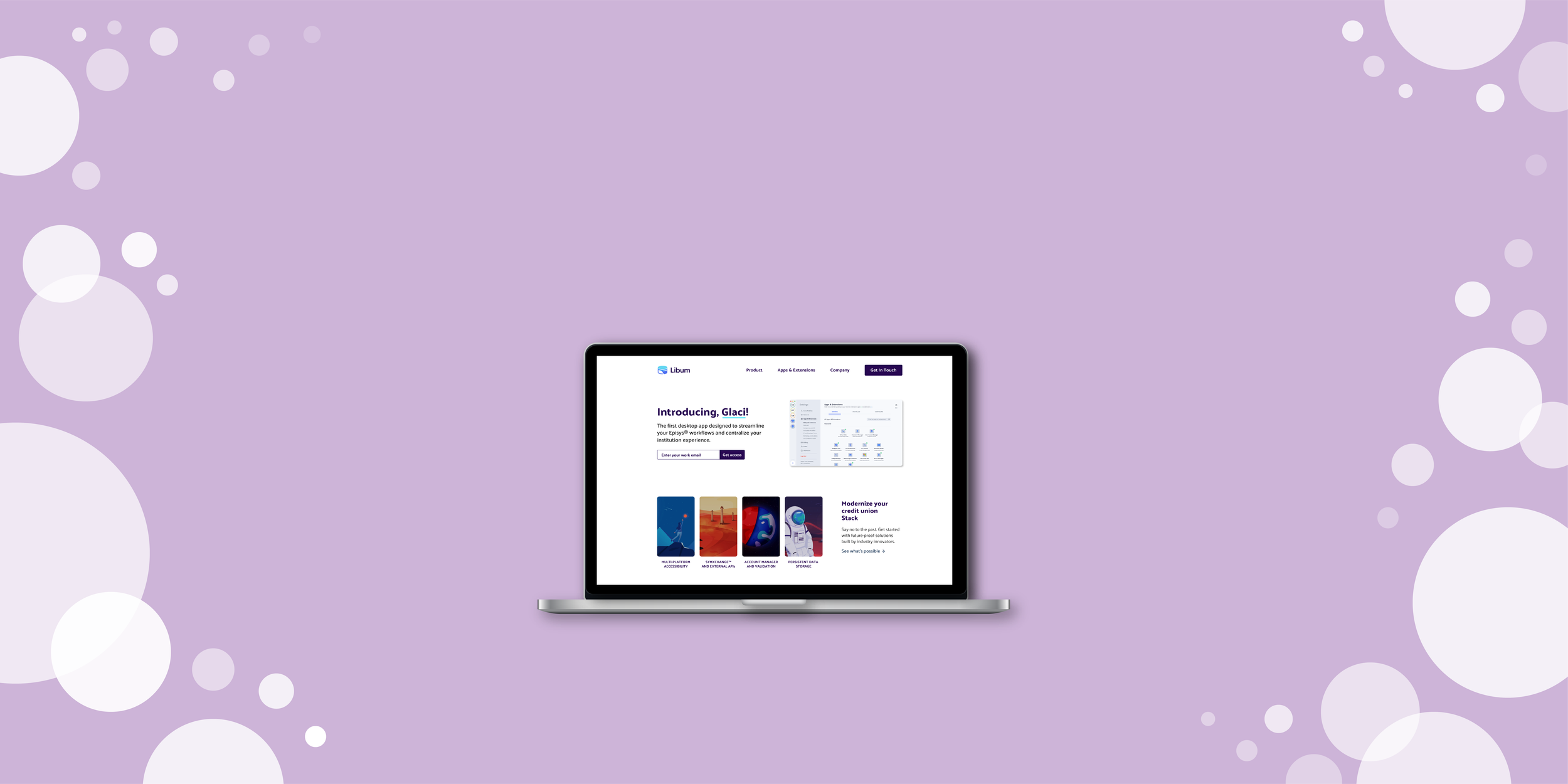
Libum is a SaaS (Software as a Service) start-up that develops credit union software to modernize banking processes for employees while providing a cutting-edge user experience. Its corporate website, which is still being developed, will be a central place to view detailed product information and access a library of apps and extensions. The current design provides a strong initial structure, but lacks streamlined processes, branding consistency, and accessibility practices.

Take a look at Libum’s existing website before the redesign.
Meet Libum’s Existing Site
Libum’s corporate website provides detailed product and company information. Users (a.k.a credit union employees) can also access and download apps and extensions from a library. The goal of the website is to inform, equip, and provide easy access to resources.

Home Page
Libum’s home page features a brief product overview, internal links to informational pages, featured products, and CTA banner buttons.

Apps & Extensions Page
Users can access Libum’s hub for different apps and extensions and view by category.

Product Page
The Product page highlights featured products and company information.
The Structure
Libum’s existing website structure provided a solid framework for its content organization. I didn’t alter the structure, but rather focused on streamlining user tasks within these pages, as well as creating the Apps & Extensions Selected Product page.

Libum’s Website Structure
Users can access in-depth product details within the four-page structure and submit a contact form via the Get In Touch button.
Pain Points
Libum’s existing website has several areas of concern that I focused on addressing:
Accessibility Concerns: UI elements, buttons, and font colors don’t meet WCAG standards.
Unclear Site Navigation: The lack of visual indicators don’t signal the user’s location within the site.
Inconsistent Hierarchy: The site’s hierarchy and content organization don’t support a streamlined browsing experience.
No Branding Guide: The lack of an established branding guide causes site-wide inconsistencies.

Branding Guide
Libum’s existing website uses a variety of bright, pleasing colors. However, without an established branding guide or color palette, it presents several inconsistencies across the site. Creating a foundation for company identity was one of my first tasks.
Color Palette
I started by gathering the color hexes and grouping them by primary and accent colors. I cross-checked each hex for color contrast levels and increased the shades to meet WCAG standards. After passing several drafts through team feedback, we finalized Libum’s official color palette.

Define the Colors
I grouped the hexes into main and accent colors and defined each usage across the site.
CSS Markdown Board
To ensure that our team follows branding guidelines, I created a basic CSS markdown board. It’s organized by sections to provide code with a visual reference. While HTML & CSS isn’t my area of specialization, it was a fun challenge to practice my understanding of front end development.

Coding the Styling Elements
I highlighted the CSS properties for each element and included the UI equivalent.
“One of the biggest challenges was accomplishing minimum contrast levels while staying true to Libum’s branding colors.”

UI Styling Updates
I made several UI element updates to improve overall visual cohesiveness and meet accessibility standards. One of the biggest challenges was accomplishing minimum contrast levels while staying true to Libum’s branding colors. I presented many drafts to the team as we refined the site’s styling.
Main Navigation

Before
The Get In Touch page has poor color contrast, as well as the hover, selected, and active states.

After
I changed the Get In Touch to a button and enhanced the hover, selected, and active states (see Accessibility Adjustments section below).
Email Input Field
One of the biggest challenges was updating the email input field to meet accessibility standards while staying true to branding colors. After several drafts, I landed on one that meets contrast levels and is in alignment with the color palette.

Before
The existing input field font and background colors have poor contrast levels and don't provide a strong visual cue for selected and active states.
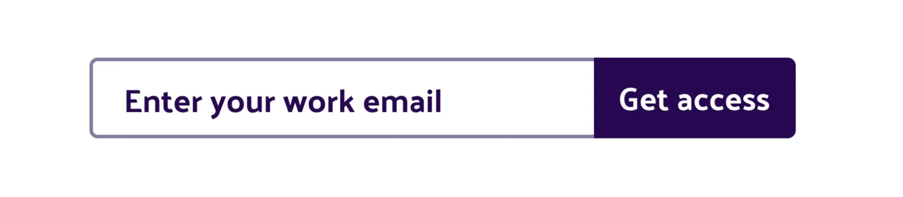
After
I adjusted the font color and added an outline. For selected and active states, I used a soft blue color fill (see Final Prototype).
Buttons & Banners
I updated all button font and background colors to meet acceptable color contrast levels. The team also loved the idea of using animation, so I added an arrow to the right of the text.
Before
The light blue buttons have poor color contrast. The banners use faint line dividers, which don’t offer clear content separation.

After
I updated button font and background colors to meet acceptable color contrast levels and added an animated arrow. I also gave the banners a color fill.
Content Box Selection
For hover and active state, I changed the content box outline color to lilac and ice blue and slightly increased the stroke. Rather than using the electric blue accent color, l opted to use softer hexes that still meet contrast levels.

Before
The content selector outline and font have poor contrast. The decorative underline and the arrow elements don’t add tangible value.

After
I changed the outline and font colors, as well as removed the decorative underline and arrow.
New Additions
Selected Apps & Extensions Page
I built a new page to provide in-depth information about a specific app or extension. This page provides easy access to product details while streamlining the download process.

Easy Access
The new Selected Apps & Extensions page allows easy access to detailed product information, highlighted features, downloads, and suggested apps.
Apps & Extensions Product Cards
While the Apps & Extensions page previously existed, I created new product cards to enhance visibility. I also adjusted and moved the “View all” section buttons to improve the page’s structural flow.

New Cards, Improved UI
I created new product cards that include the title, icons, and summary.

Accessibility Adjustments
I evaluated Libum’s existing website to address a variety of accessibility concerns. My adjustments include color contrast levels, enhanced navigation, and content hierarchy.
Color Contrast

Finding the Right Contrast
I cross-checked all font and background colors to ensure that minimum contrast levels were met or exceeded.
Hover, Active, and Selected States

Main Navigation & Footer
I added a dark purple underline to the main navigation and footer pages, which helps guide users who may tab rather than mouse.

Internal Links
I added a teal underline to internal links for enhanced visibility.

Content Box Selectors
I added a soft purple outline to hover, active, and selected state content boxes.
Header Hierarchy & Font Size

Labeling Headers & Font Sizes
When creating the CSS markdown board, I labeled all headers and font sizes to ensure site-wide consistency (see orange notes).
The Redesign Prototype
Take a look at the live prototype to see Libum’s freshly redesigned website in action. I’ve included user flows for all pages except the contact form.

Conclusion
The website redesign project grew my understanding of cross-functional team collaboration and cultivated a greater empathy for users. Partnering with the Libum team taught me countless valuable lessons:
Lessons Learned
1. Cross-functional understanding is essential for a healthy team. At first I struggled to grasp different viewpoints. After several clarifying conversations, I gained a greater appreciation for my teammates and their roles.
2. Web accessibility is for everyone - the team included. I shared fun hands-on learning activities with my teammates, such as a color contrast test, to help grow awareness.
3. Appreciate the old when building the new. I was challenged to honor Libum’s original branding concepts while making necessary updates.